The question ‘Should I learn Python, R or SQL for data science?’ is a common one amongst new starters in the field of data science. I have often seen blogs explaining for instance how: “Python is better as it will allow you to do other things as well as data science” or “R is better at doing statistical analysis” and so on.
Mind the knowledge gap?
While it’s perfectly valid to hold an opinion on these things as an experienced data developer, I have often thought that for beginners, statements like these can be unhelpful. I think this is because they can promote the idea that one of these languages is inherently more valuable than another.
Furthermore, I worry that people might hear that learning Python for example is the only way to get into data science. They might then spend a lot of time learning Python and not solving common data challenges such as preparing and cleansing data, selecting models and applying tests.
80/20 rule strikes again
These common tasks fall under the umbrella of an area of data science called ‘data wrangling’. It has often been argued that data scientists spend up to 80% of their time on these tasks. This is exactly the opposite of what most people expect data scientists to be doing. (e.g. wearing lab coats, using scientific calculators etc.)
Data scientists, according to interviews and expert estimates, spend from 50 percent to 80 percent of their time mired in this more mundane labor of collecting and preparing unruly digital data, before it can be explored for useful nuggets.
Steve Lohr, New York Times
Aug. 17, 2014
It’s my belief that all of these languages are equally good at ‘data wrangling for beginners’ and that the answer to the question which language should I learn for data science is ‘any or ideally all of them’. I would argue that if you are just starting off on your data science journey, any of these languages would be a reliable toolkit for tackling the challenges you need to overcome on the way.
The important thing to do as a beginner, is to get some data from a real world scenario and try to draw an inference from the data that allows you to learn something about the subject matter. The skills that you learn by doing this are entirely transferrable to any programming language.
Background on these three languages
It’s worth giving some background on these three languages as there are some significant differences in design principles and architecture. SQL is a declaratively written query language which you use to communicate with the SQL engine. The language syntax is built around the idea of querying the database engine about the data in an English-like syntax. It is designed for working with relational data and is unlikely to perform well in other scenarios. SQL has been around since the late 70s in it’s various forms.
Python and R by comparison, are both interpreted multi-model languages which support for example functional programming as well as imperative and object-orientated programming (and others). These languages, both created in the early 90s, can be used for a variety of tasks and are by no means as data bound as SQL will always be. R was specifically created to be a re-imagining of the statistical computation language called S which is much older. Python was created by a single guy who wanted to create a clean and simple yet powerful language that allowed developers to get started quickly.
Four common data wrangling tasks.
I’m going to try to avoid comparing ‘features and benefits’ of each language as there are many hundreds of articles around the internet that provide this already. Instead, I will aim to demonstrate their core similarities by doing the same data wrangling task that you would do as part of a normal data analysis job in each of the different languages.
The tasks we will use to test my theory are as follows:
1. Data Load
2. Looking at top 10 and bottom 10 values to see the type of values or the range of a column
3. Summarising and aggregating data
4. Visualising data
The data I am using as part of this experiment is meteorological outdoor temperature readings taken from the roof of the Create Centre in Bristol on an hourly basis. The source for this data is here.
1. Data Load
Below you can see how each of these languages would typically handle the task of loading data into a structure that allows for easier analysis later on. In Python and R, we load into Data Frames (Explanation of Data Frames here) which are essentially the same kind of two-dimensional data structure with columns and rows that are called tables in SQL except data frames in both of these languages are held in-memory instead of on disk. While it is possible to hold a table in-memory in SQL as well, in SQL Server this requires a lot more effort.
SQL requires us to create a physical relational table on disk then insert the data from the CSV starting on Row 2.
CREATE TABLE temps ([Date Time] datetime, Temperature decimal(5,2))
BULK INSERT temps FROM 'C:\Users\Steve\Downloads\meteorological-data-create.csv'
WITH (FIRSTROW = 2, FORMAT='CSV');
Python has many libraries available to manage data, here we are using the Pandas library to automatically read the CSV with default settings into a new dataframe called temps.
import pandas as pd
temps = pd.read_csv("meteorological-data-create.csv")
temps
In R we are using a built-in library to read the CSV into a new dataframe using some simple settings.
temps <- read.csv(file="meteorological-data-create.csv" header=TRUE, sep=",")
temps
2. Profiling and bottom 10 rows
As you can see, loading data in all of these languages is relatively easy and all of the languages have similarities in the syntax they use to do this. This is great for us as it means that the skills learnt in one language are almost entirely transferrable to another of these languages. Now we would like to profile our data and see the top 10 and bottom 10 temperatures available in the dataset.
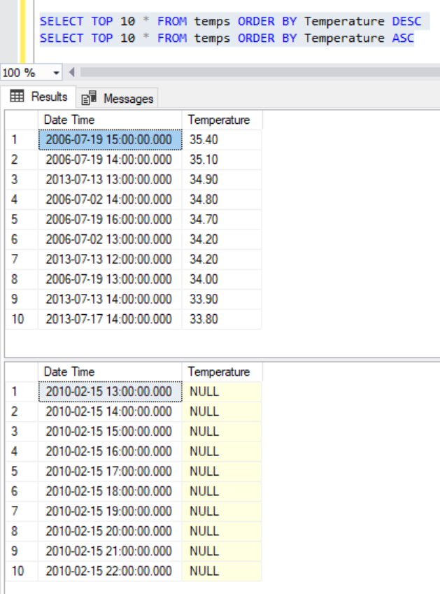
A key difference between SQL and the others is that SQL allows us to re-use that physical table we created earlier even if we have shut down / restarted the server. This is because it’s stored on a physical disk. We do just that here and select the top 10 by specifying an order in the ‘order by’.
SELECT TOP 10 * FROM temps ORDER BY [Date Time] ASC
SELECT TOP 10 * FROM temps ORDER BY [Date Time] DESC
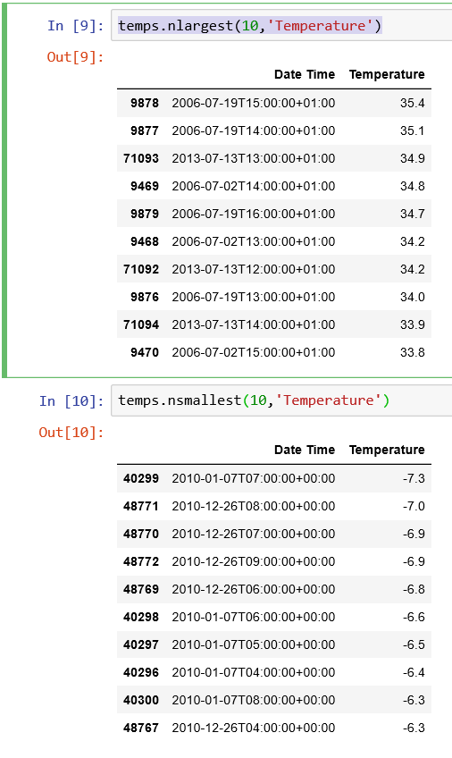
Python has some useful functions called ‘nlargest’ and ‘nsmallest’ in the pandas library, we use these here to return the top and bottom 10 rows.
temps.nlargest(10,'Temperature')
temps.nsmallest(10,'Temperature')
R uses a similar process, where we sort the data frame and only fetch the 10 rows from the head of the frame. This returns an array:
head(sort(df1$Temperature,decreasing=TRUE), n = 10)
head(sort(df1$Temperature,decreasing=FALSE), n = 10)

It’s interesting to note here that our first data quality issue has arisin, but it’s only visible through the SQL query. We have discovered that there are NULL values in our dataset. This is visible through SQL as it treats NULL values as if they were ‘small values’ rather than ‘non-values’ as Python and R treat them. It’s an interesting difference between these languages and highlights why profiling and understanding data is such a valuable skill.
3. Summarising and aggregating data
Now we have some understanding of the range of the data, we might want to zoom in a bit closer and see the month minimum and maximum temperatures for each month across the whole dataset.
In SQL we would achieve this with some aggregate functions (MIN,MAX) and a ‘Group By’ to aggregate the data. We group all the dates in a single month into a single row for each month by computing a new date using the helpful function DATEFROMPARTS which creates a new day from integers for year, month and day, we simply add 1 as the day then add this new field to the Group By as so:
SELECT
        DATEFROMPARTS(YEAR([Date Time]),MONTH([Date Time]),'01') AS [Month],
	MIN(Temperature) AS [MinTemp],
	MAX(Temperature) AS [MaxTemp]
FROM temps
GROUP BY DATEFROMPARTS(YEAR([Date Time]),MONTH([Date Time]),'01')
ORDER BY DATEFROMPARTS(YEAR([Date Time]),MONTH([Date Time]),'01')
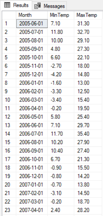
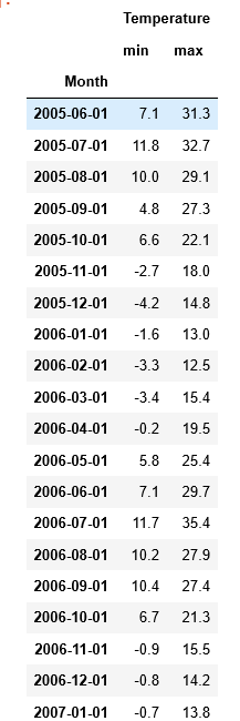
In Python we follow virtually the same procedure, although in Python we have got this far without declaring that the ‘Date Time’ field is the DateTime datatype where in SQL we have to do this before we start. We then add a new column called ‘Month’ to the dataframe which is the first day of each month to aggregate the monthly values. Finally we use ‘groupby’ to apply the ‘min’ and the ‘max’ to this dataframe.
temps["Date Time"] = pd.to_datetime(temps["Date Time"])
temps['Month'] = temps["Date Time"].apply( lambda temps : pd.datetime(year=temps.year, month=temps.month, day=1))
temps.set_index(temps["Month"],inplace=True)
temps.groupby('Month').agg({'Temperature':['min','max']})
In R, we again do a very similar process. We use the excellent ‘zoo’ library to turn a datetime into a date set on the first day of each month as we did previously. We then use the built-in aggregate feature to group summarise the ‘Temperature’ column by the new month field we just created; applying the ‘min’ and ‘max’ functions on this field during these aggregations. This produces a dataframe which has too many columns, so we then select only the columns that we need using their numerical index (1,2 and 4) then re-alias them as ‘month’, ‘min’ and ‘max’.
library(zoo) df1$month <- as.Date(as.yearmon(df1$Date.Time))
SummarisedTemps <- data.frame(aggregate(Temperature ~ df1$month, data=df1, FUN=min),aggregate(Temperature ~ df1$month, data=df1, FUN=max))
SummarisedTemps <- SummarisedTemps[,c(1,2,4)]
colnames(SummarisedTemps) <- c("month", "min", "max")

4. Visualising Data
Until recently, it would have been relatively difficult to continue the comparison at this point as SQL (At least in the Microsoft ecosystem) has never typically had a built in visualising tool, even for simple data profiling. Recently however, Microsoft have released Azure Data Studio for Linux, OSX and Windows based on their popular VS Code platform.
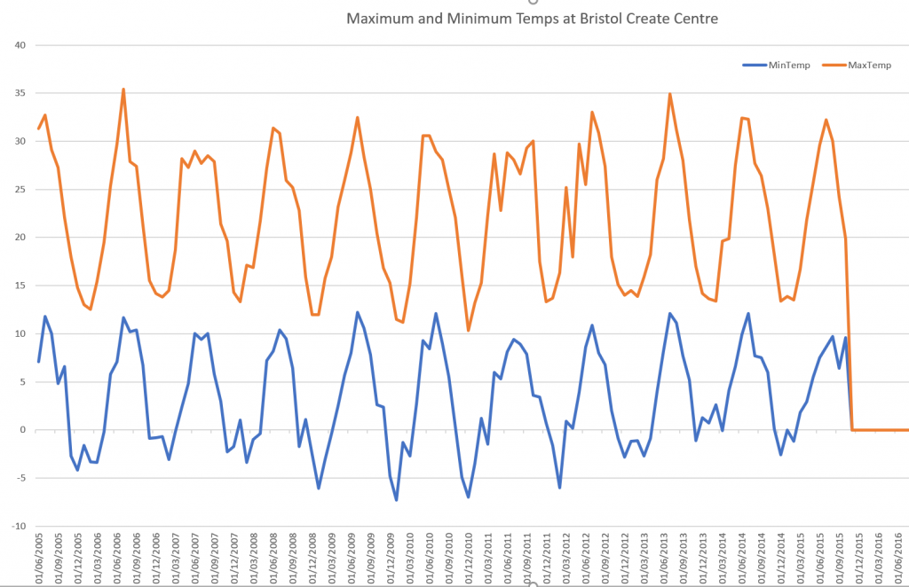
It was relatively easy to click a button on the right hand side of the screen and select a bar graph for my data set using the very same query as I used above. This graph was created without any code, but it was a bit fiddly with a few clicks to set up, the result is below.
Alternatively if you don’t have Azure Data Studio you could use the venerable Microsoft Excel by simply copying the data out of the query results and using Excel’s chart feature. In this case I decided to use Excel as I wasn’t able to get Azure Data Studio to make a line plot in the way that I wanted it to.
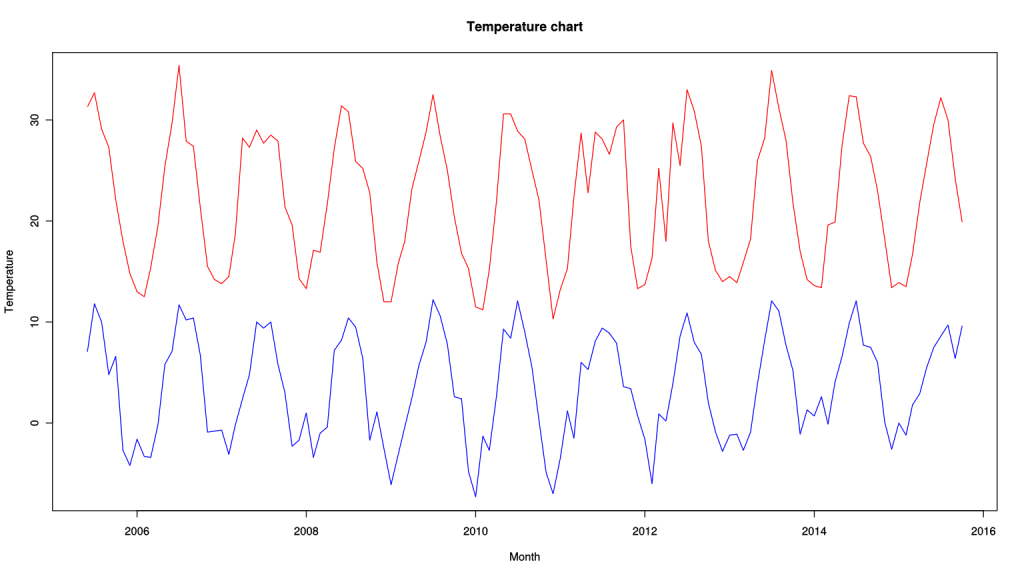
With Python we do need some code and the help of the MatPlotLib library. With that imported, we set the size of the plot to 40x20inches. We then run the same aggregatation we created earlier and I just tag .plot().show() on the end. MatPlotLib helpfully (or perhaps unhelpfully?) does the rest for you, including working out what kind of data to show, labelling the axes and deciding what each axis scale should be. See below for code and results:
import matplotlib.pyplot as plt
plt.rcParams['figure.figsize'] = [40, 20]
temps.groupby('Month').agg({'Temperature':['min','max']}).plot().show()
In R we have to take slightly more control of the plotting process, we set the size of the plot to a larger size like we did in Python, we then plot the min line and assign the labels for the plot (xlab,ylab for each axis and main for the title). To add an additional line to the plot we use lines() for each additional line. The type property informs plot() that we would like a line plot.
options(repr.plot.width=16, repr.plot.height=9)
plot(SummarisedTemps$month,SummarisedTemps$min, type = "l", col = "red", xlab = "Month", ylab = "Temperature",main = "Temperature chart", ylim=c(-7,35) )
lines(SummarisedTemps$month,SummarisedTemps$max, type = "l", col = "blue")
To SUM() up
Well that’s it for now! What I hope to have demonstrated is that all three of these languages in the data space are more than capable of achieving exactly the same results with actually less syntactic difference between them than you might expect.
I hope to have also demonstrated that while these languages might seem complex from the outside, the recurring problems that data scientists are spending a lot of their time on day-to-day are actually totally common sense kind of things that anyone would be able to spot.
All of these languages in my opinion have a relatively shallow learning curve to start with which I think makes them all pretty accessible and an ideal learning ground for those who would like to get into data science.
If you are interested in following along with the blog inside your own Jupyter notebook you can get free compute at Azure Notebooks and you will find all of the code used in this blog at my GitHub page here.

